
Button
A reusable button component with various styles and states
Preview
Code
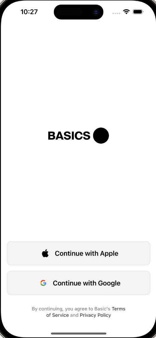
1import SwiftUI23let backgroundGradient = LinearGradient(4 colors: [Color.white, Color.sand7],5 startPoint: .top, endPoint: .bottom)67struct AuthWithGradientView: View {8 9 var body: some View {10 VStack {11 Spacer()12 13 // Your Logo14 Image("basics-logo")15 .resizable()16 .aspectRatio(contentMode: .fit)17 .foregroundColor(.black)18 .frame(height: 40)1920 Spacer()21 22 // Continue with Apple Button23 Button(24 action: {25 // add action here26 },27 label: {28 HStack{29 Image("apple-icon")30 .resizable()31 .frame(width:20, height: 20)32 .padding(.horizontal, 6)33 34 Text("Continue with Apple")35 .bold()36 .foregroundColor(Color.black)37 }38 .frame(maxWidth: .infinity, minHeight: 60)39 .background(Color.gray3)40 .cornerRadius(10)41 .overlay(42 RoundedRectangle(cornerRadius: 10)43 .stroke(Color.gray6, lineWidth: 1)44 )45 })46 47 Spacer()48 .frame(height: 15)49 50 // Continue with Google Button51 Button(52 action: {53 // add action here54 },55 label: {56 HStack{57 Image("google-icon")58 .resizable()59 .frame(width:20, height: 20)60 .padding(.horizontal, 6)61 62 Text("Continue with Google")63 .bold()64 .foregroundColor(Color.black)65 }66 .frame(maxWidth: .infinity, minHeight: 60)67 .background(Color.gray3)68 .cornerRadius(10)69 .overlay(70 RoundedRectangle(cornerRadius: 10)71 .stroke(Color.gray6, lineWidth: 1)72 )73 })74 75 // Legal Disclaimer76 Text("By continuing, you agree to Basic's [Terms of Service](https://basics.com/terms-of-service) and [Privacy Policy](https://basics.com/privacypolicy) ")77 .multilineTextAlignment(.center)78 .foregroundColor(Color.gray11)79 .tint(Color.gray12)80 .padding(.top, 20)81 .font(.caption)82 .frame(width: 250)83 }84 .padding()85 .background(backgroundGradient)86 }87}8889struct AuthWithGradientView_Previews: PreviewProvider {90 static var previews: some View {91 AuthWithGradientView()92 }93}